Safari 27.1 on iPhone Duo: Foldable Screen APIs and Viewport Sizes
Safari 27.1 adds fold-aware web APIs in preview and adapts PDFs to iPhone Duo’s hinge posture. Responsive layouts remain the practical foundation.
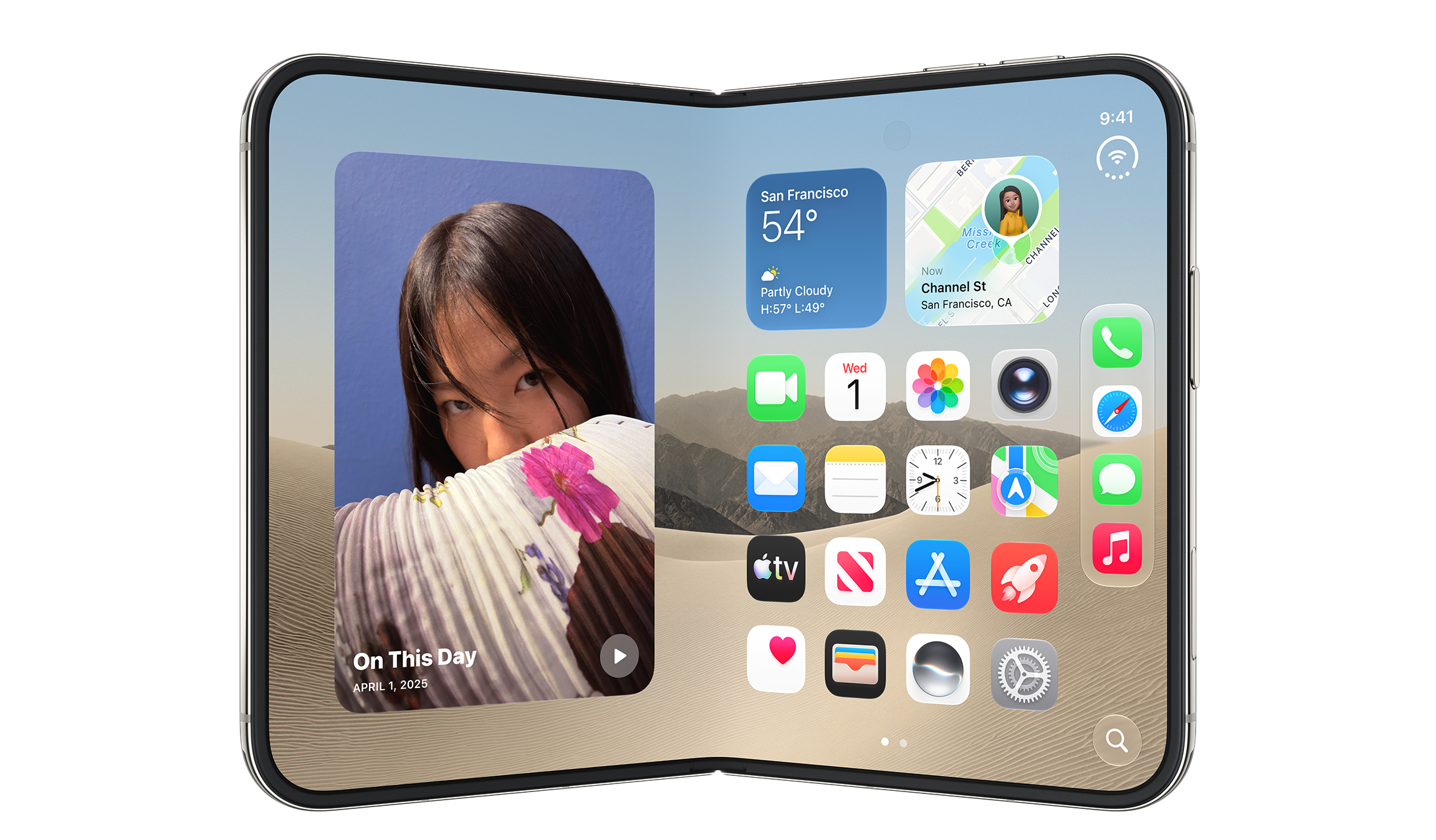
Safari 27.1’s main web development story is continuity: iPhone Duo runs the same WebKit engine and web technologies as other iPhones. Existing sites and web apps should work across the new device’s displays without device-specific code. The release adds a small user-facing adjustment for PDFs and an early look at APIs that let developers respond to a folding screen.
When someone reads a web PDF with iPhone Duo partly folded like a book, Safari displays two pages side by side. Flattening the screen or closing it fully returns the document to a single-page view. For developers, the Device Posture API and Viewport Segments API are available as previews behind feature flags. Their presence gives teams a chance to explore fold-aware layouts, though both features may still change.
One browser, several viewport shapes

The device has a smaller outer display and a larger inner display. Both can be used in portrait or landscape, but the browser controls differ: Safari places the tab bar at the bottom on the outer display and at the top on the inner display. When the inner screen is in landscape, two windows can sit alongside each other, leaving each with a narrow portrait viewport. As on other iPhones, scrolling makes the tab bar shrink to give the page more room.
That range matters more than any single device measurement. Safari 27.1 viewports span 382 to 951 CSS pixels in width and 368 to 902 pixels in height. The available combinations are:
| Display and orientation | Width | SVH | LVH |
|---|---|---|---|
| Outer display, portrait | 382 | 580 | 618 |
| Outer display, landscape | 594 | 368 | 406 |
| Inner display, portrait, one tab | 669 | 867 | 902 |
| Inner display, landscape, one tab | 951 | 585 | 620 |
| Each window with two side by side | 385 | 571 | 609 |
These figures are useful when checking a layout, but they aren’t a reason to build a special case for every pose. Flexible CSS layouts using Grid, Flexbox, media queries and other responsive techniques are still the right starting point. Detect browser capabilities with feature detection instead of identifying a device from its user agent. That approach keeps a project adaptable as screen sizes and devices vary.
Testing doesn’t require the hardware. Xcode 27.1 or later includes Device Hub, which can create and run an iPhone Duo simulator.
Building for the fold
The preview APIs address two different questions: whether the screen is folded, and how many distinct viewport areas it exposes. To try them, enable “Device Posture API” and “Viewport Segments API” under Settings > Apps > Safari > Advanced > Feature Flags.
Device Posture API
The Device Posture API reports one of two states. folded means the screen is partly folded in a book or laptop pose. continuous covers a flat screen, whether the device is fully open or fully closed. CSS can respond through the device-posture media query; JavaScript can read navigator.devicePosture.type and listen for a change event.
@media (device-posture: folded) {
  .layout {
    display: grid;
    grid-template-columns: 1fr 1fr;
  }
}
This makes posture a layout input rather than something a site has to infer from screen dimensions. A page could, for example, switch to a two-column arrangement when the user holds the device partly folded.
function reportPosture() {
  console.log(`Device posture: ${navigator.devicePosture.type}`);
}
reportPosture();
navigator.devicePosture.addEventListener("change", reportPosture);
Viewport Segments API
The Viewport Segments API describes the separate areas on either side of a fold. Safari 27.1’s preview supports the horizontal-viewport-segments and vertical-viewport-segments media queries. They report segments arranged side by side or stacked vertically:
@media (horizontal-viewport-segments: 2) {
  /* Two side-by-side segments, as in a book pose */
}
@media (vertical-viewport-segments: 2) {
  /* Two vertically stacked segments, as in a laptop pose */
}
Six environment variables provide segment width, height and each edge’s position: viewport-segment-width, viewport-segment-height, viewport-segment-top, viewport-segment-right, viewport-segment-bottom and viewport-segment-left. Each takes a column index followed by a row index, starting at zero in the upper-left. For two side-by-side segments, the left is 0 0 and the right is 1 0; for stacked segments, the top is 0 0 and the bottom is 0 1.
A grid can use those measurements to match each column to its segment:
@media (horizontal-viewport-segments: 2) {
  .wrapper {
    display: grid;
    grid-template-columns:
      env(viewport-segment-width 0 0)
      env(viewport-segment-width 1 0);
  }
}
JavaScript can also read window.viewport.segments, an array of DOMRect objects. Recheck it when posture changes or the window resizes, since the segment geometry can change with the device’s configuration.
function reportSegments() {
  window.viewport.segments.forEach((segment, i) => {
    console.log(`Segment ${i}: ${segment.width}px × ${segment.height}px`);
  });
}
reportSegments();
navigator.devicePosture.addEventListener("change", reportSegments);
window.addEventListener("resize", reportSegments);
Room beside Safari’s controls
The outer display is wider and shorter than other iPhone screens, so iOS places controls along the side to preserve vertical space. Safari 27.1 currently fills the area beneath those controls by extending the page’s background color; web content itself doesn’t reach into that space.
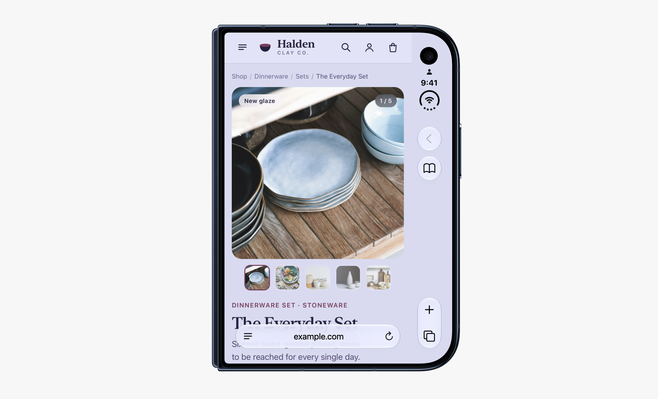
Web designers may want to continue a header or another visual element across the full display. One possible route is viewport-fit="cover" in the HTML viewport meta tag, paired with environment variables that keep important content clear of system controls. But WebKit says it has found many sites that don’t inset all four edges correctly. The team is exploring an easier approach, so the safe choice for now is to treat this area as unavailable to page content.
The APIs are still previews, and the design for using the space beside the controls remains open. Developers can share ideas with Jen Simmons on Bluesky or Mastodon. Safari interface issues can go through Feedback; web technology and Web Inspector issues can be filed as a WebKit bug report. For now, responsive layouts cover the broad device range, while the posture and segment APIs offer a way to test more tailored fold-aware experiences.